
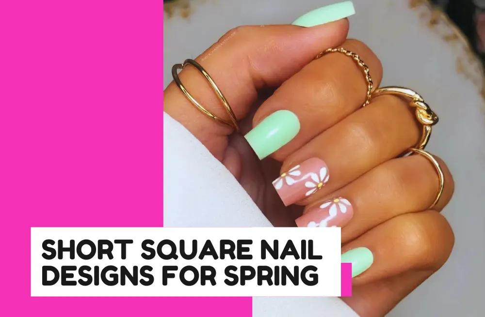
Spring always brings back short square nails, and I get why. They’re easy to wear, they grow out well, and almost every spring color looks good on them.
I pulled together 35 designs that stood out for different reasons. Some are simple, some lean into florals, and a few play with color in ways I hadn’t seen before.
Hopefully one of them saves you from staring at the salon color wall for twenty minutes.
What Colors are in for Spring Nails for 2026?
01/35 — Tiny Strawberries
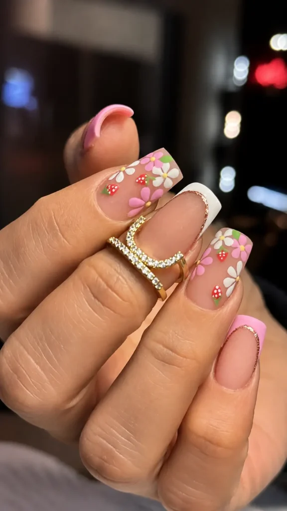
The flowers are cute. The strawberries are what make you stop scrolling.
Also, whoever decided fruit belongs on nails deserves a raise, because this somehow feels less cheesy than half the floral sets out there. It just looks like spring without trying too hard.
02/35 — Blue Floral Short Square Nails
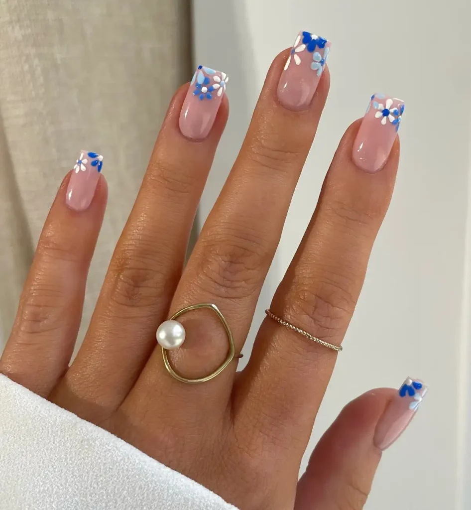
Those tiny blue flowers completely change this set. If they were spread across the whole nail, it’d feel busy.
Keeping them right along the tip leaves plenty of negative space, so the design still feels clean. I’d skip extra rhinestones here. It already has enough going on.
03/35 — Pastel Rainbow
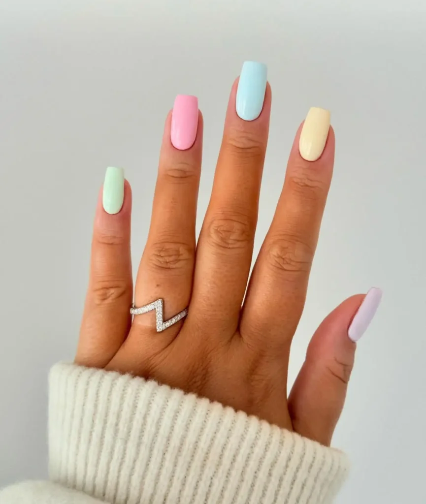
Four pastel shades, no nail art, and somehow it still doesn’t look boring. The trick is sticking to soft, creamy colors instead of bright candy tones. If you can’t decide on one spring color, this is probably the easiest answer.
04/35 — Pink Heart Short Square Nails
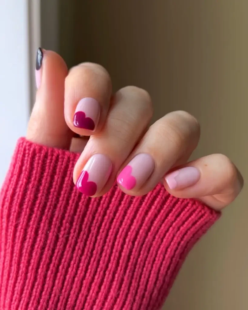
The hearts aren’t perfectly centered, and that’s exactly why I like them. They look less planned and more playful.
This is the kind of manicure that works for February and also for Spring. I mean, why not? Honestly it doesn’t need Valentine’s Day as an excuse.
05/35 — Swirl Lines
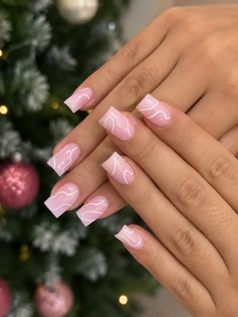
The swirls are doing all the heavy lifting here. Take them away and it’s just a soft pink manicure. Leave them in, and suddenly the whole thing feels a little more expensive.
06/35 — Pastel Corners
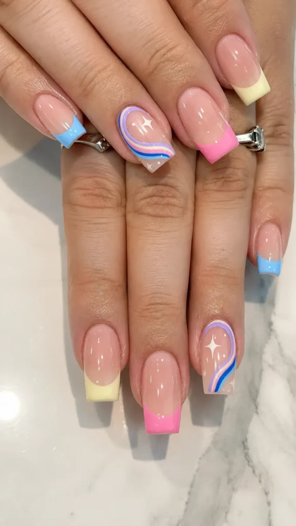
Spring is basically the only time these colors make this much sense together. The angled tips keep them from looking too sweet, which is probably why this design still feels modern.
07/35 — Mixed Pastels
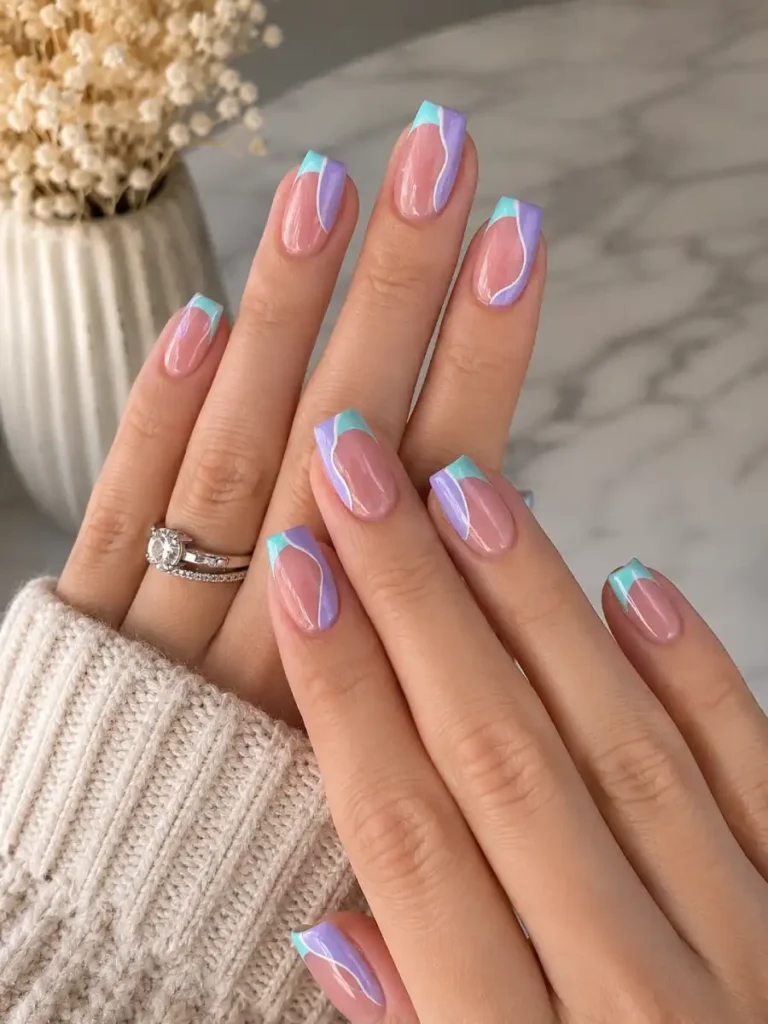
Somehow this set breaks the “pick one accent nail” rule and gets away with it. Different tips, a little rainbow, tiny stars… it sounds busy, but the nude base keeps everything under control.
08/35 — Milky White
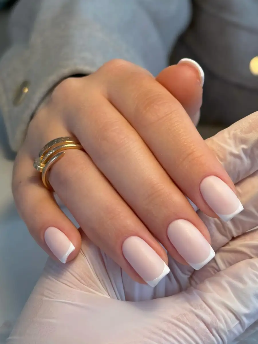
This is the manicure people end up getting after spending an hour looking for nail ideas. Clean, bright, no regrets. Sometimes the boring choice wins.
09/35 — Burgundy Florals
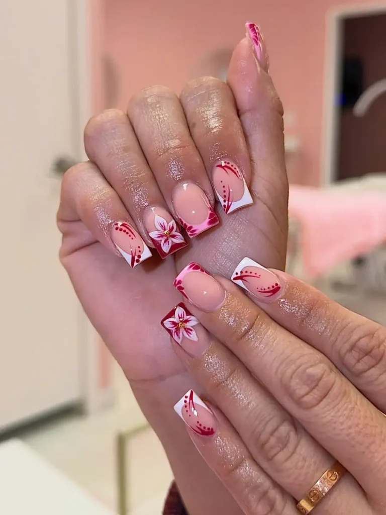
Everybody looks at the flower first. I kept looking at the corners. Those deep burgundy tips frame the whole design, otherwise the artwork would’ve just been floating around.
10/35 — Sage Daisies
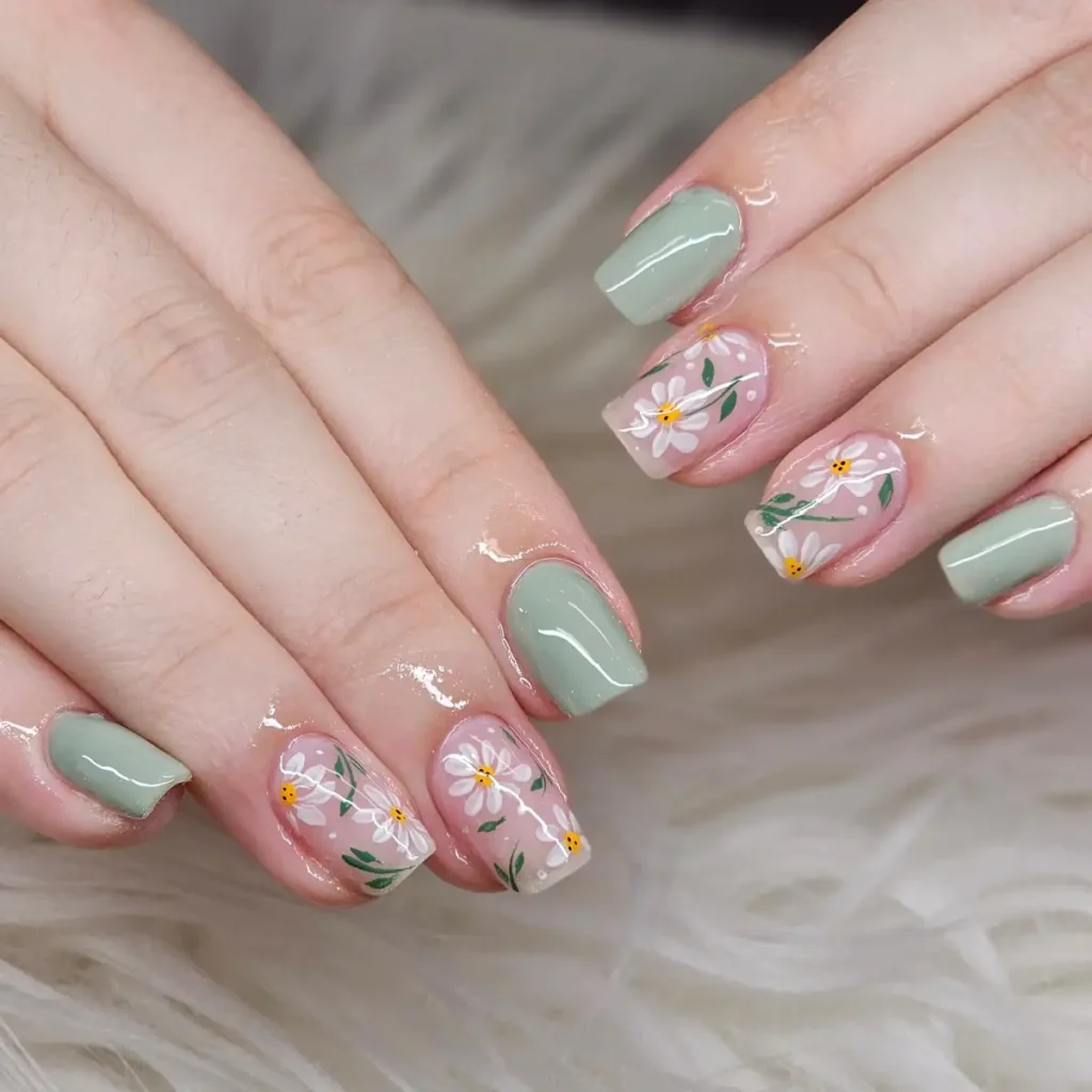
This green is carrying the set more than the flowers are. Swap it for white and these become pretty standard floral nails. The sage is what gives them personality.
11/35 — Mint Daisy French
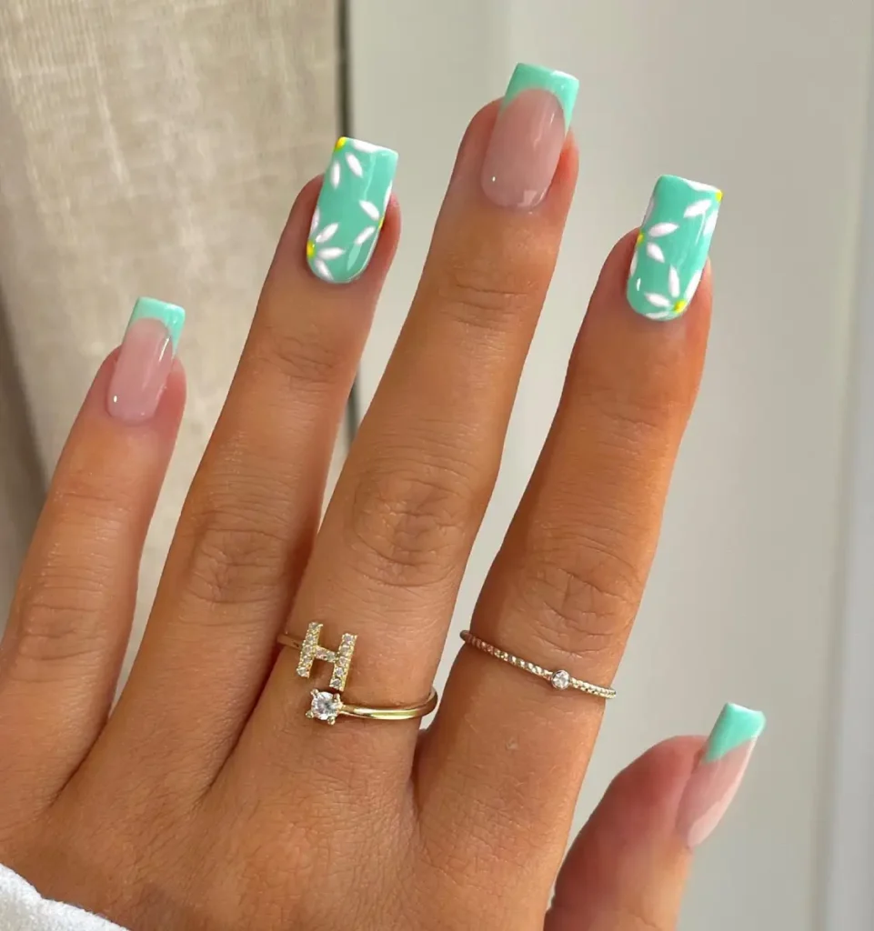
The flowers almost disappear until you look twice, which is probably my favorite part. The mint tips stop this from looking like every other spring floral set. It’s fresh without trying too hard, and that’s exactly why it works.
12/35 — Blue Daisy French
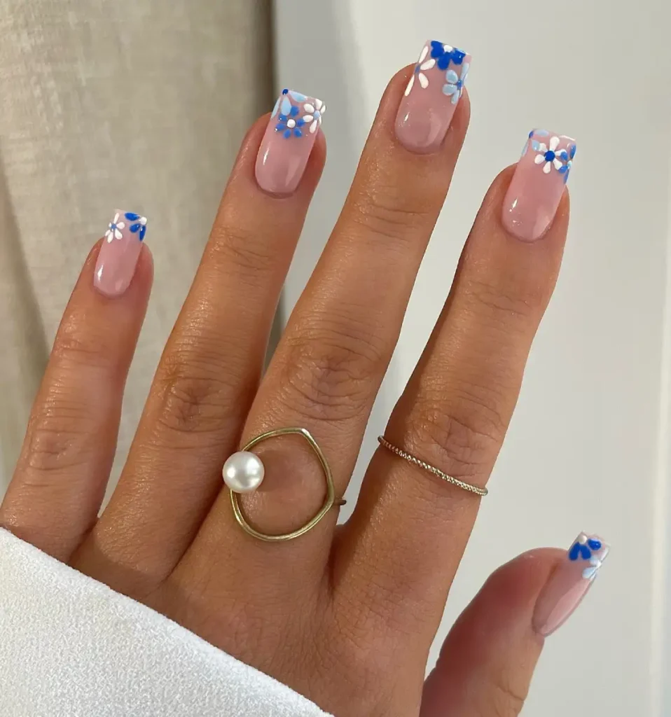
This is one of those designs where the placement matters more than the flowers themselves. Keeping everything around the tips leaves enough empty space for the blue to stand out instead of looking busy.
13/35 — Coral Flower Accent
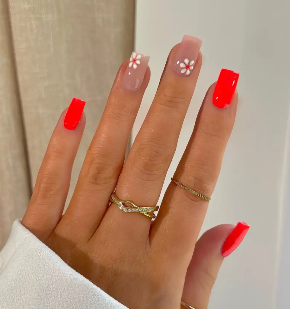
That coral is doing most of the talking here. The tiny daisies break up the color just enough so it doesn’t feel flat.
Also, using the flowers on only two nails was the right call—any more and the whole set would’ve felt crowded.
14/35 — Mocha Floral
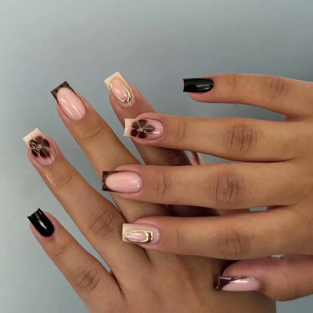
I almost missed the gold frame because the flower kept stealing my attention.
Then you notice the tortoise tips. There’s a lot happening here, but the colors stay in the same family, so it never gets messy. That’s probably why this still feels expensive.
15/35 — White Daisy
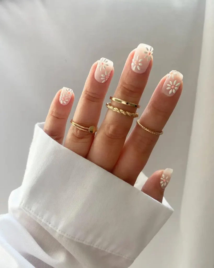
Tiny flowers are risky. Make them a little bigger and suddenly the nails start looking like wallpaper. These stay just on the right side of that line. The milky base helps too—it softens everything without making the design disappear.
16/35 — Cherry Polka Dot
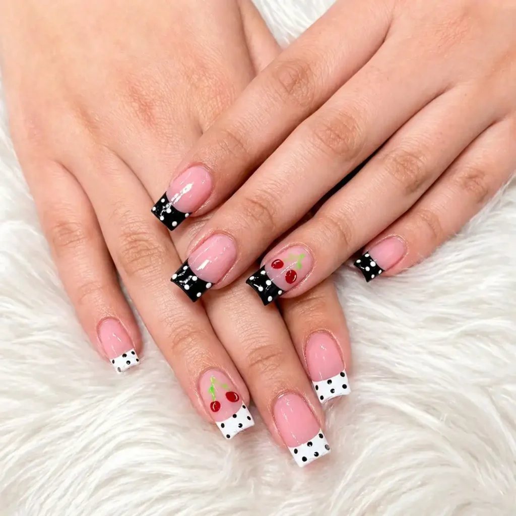
The cherries aren’t the main character here. They’re basically a little surprise sitting between all those dotted French tips.
I’d copy that idea before I’d copy the cherries themselves. Tiny accent, plain nails everywhere else. That’s a combination that almost always ages well.
17/35 — Cherry French
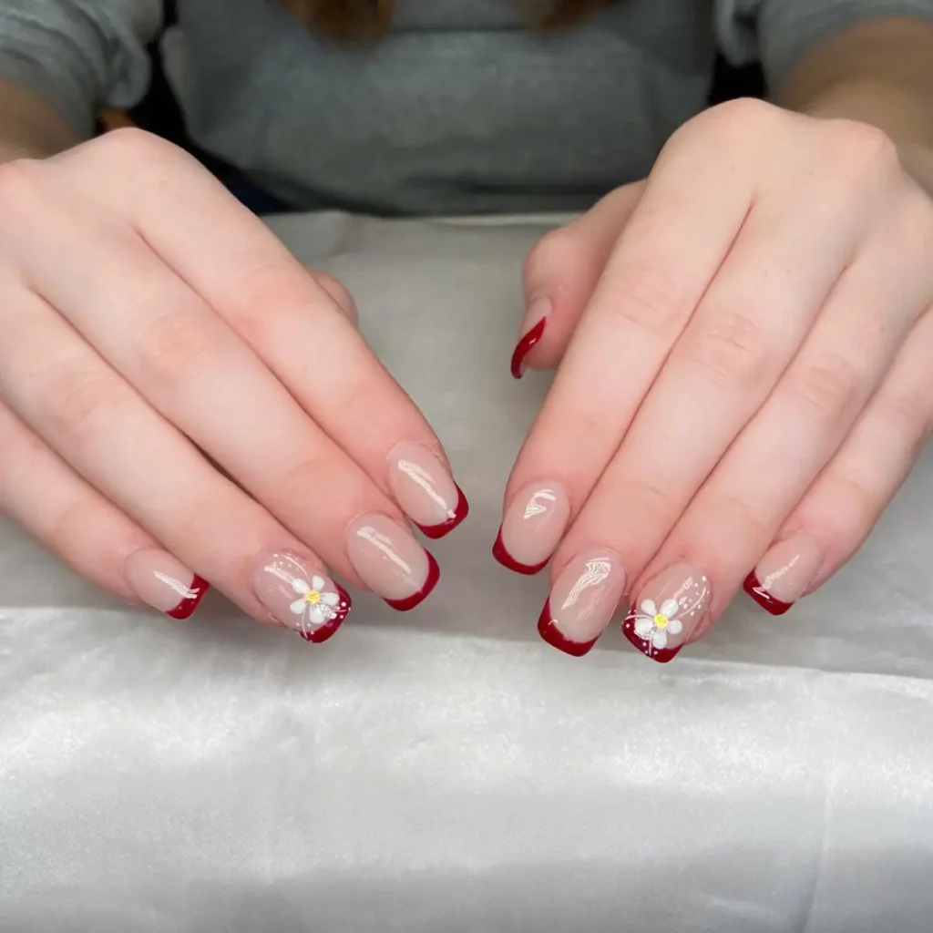
That red is carrying the whole set, and honestly, it doesn’t need much help. The little flower keeps it from feeling too serious without turning it into a full floral manicure.
I’d keep the art on just two nails exactly like this. Any more and the French tips lose the spotlight.
18/35 — Hot Pink Checkerboard
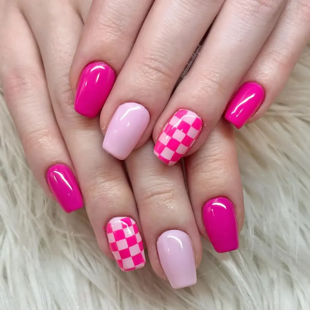
Neon pink already demands attention, so making only one nail checkerboard was the right call. If every nail had the pattern, it’d start looking like a racing flag. This version feels playful instead of chaotic.
19/35 — Winter French
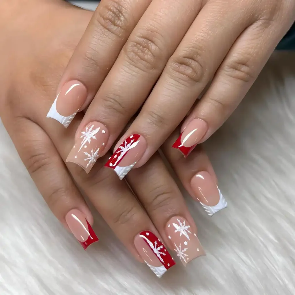
There’s something satisfying about how the snowflakes stay crisp against that warm nude base.
Also, the red and white French tips don’t even need the holiday theme to work. Strip away the snowflakes and you’d still have a really solid color combo for winter.
20/35 — Burgundy Floral
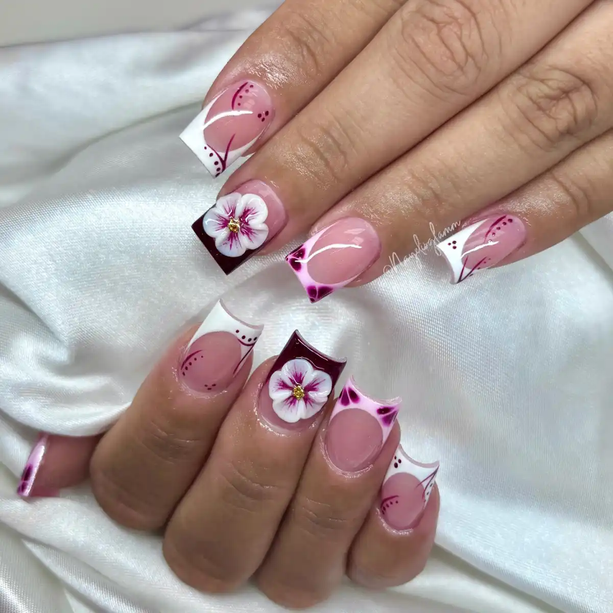
The flower is impressive, sure, but I kept looking at those blurred burgundy corners. They almost look airbrushed, and they make the whole design feel softer.
That’s probably my favorite detail here. It gives the set depth without adding glitter or chrome.
21/35 — Hibiscus French
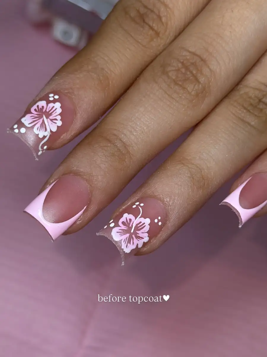
The matte finish completely changes these. If they were glossy, the pink French would probably steal all the attention. Instead, your eye lands on the hibiscus first. That’s a smart trade. Also, the negative space keeps the flowers from feeling crowded.
22/35 — Tiny Bow French
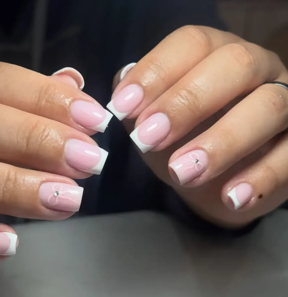
The little bow almost disappears until you notice the rhinestone in the center. That’s probably why this works. Everything else stays clean, so it still feels like a classic French instead of a themed set. Good reminder that one tiny detail is usually enough.
23/35 — Mixed Animal Print
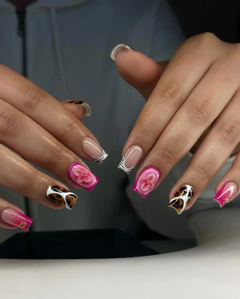
There’s a lot happening here, but somehow the pink keeps the whole thing under control. Leopard, zebra, flowers… on paper it sounds like a terrible idea. On the hand, it somehow turns into a Y2K set that actually feels intentional.
24/35 — Polka Dot Ladybug
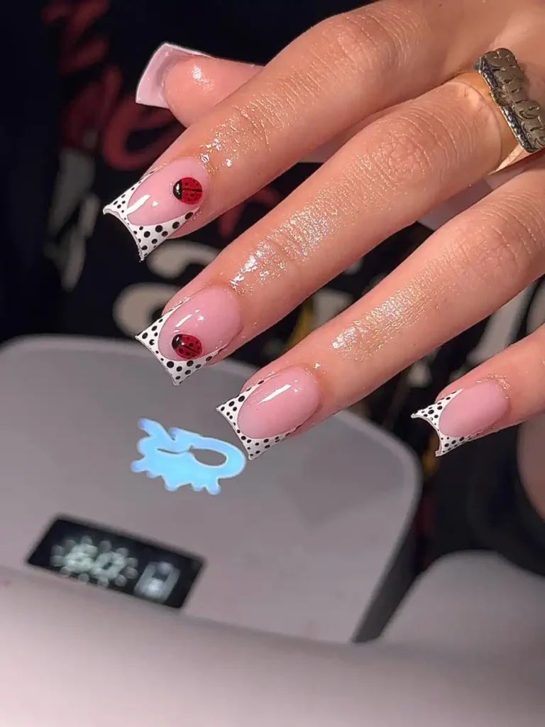
Those dotted French tips are doing more work than the ladybugs. Without them, the design would just be cute. With them, it suddenly has a vintage feel, almost like an old fabric print. Tiny change, completely different personality.
25/35 — Mint Green With Daisy Accents
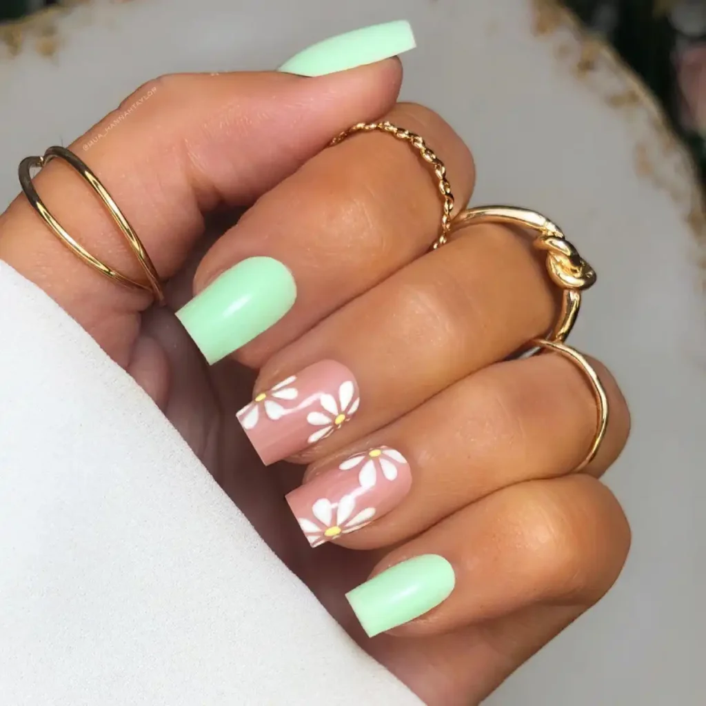
The green is what sold me here. It’s creamy instead of neon, so it doesn’t overpower the daisies. I also like that the flowers stay on two nails. Any more and this would’ve crossed into “too much.” I’d keep the rest plain exactly like this.
26/35 — Blue French With 3D Bows
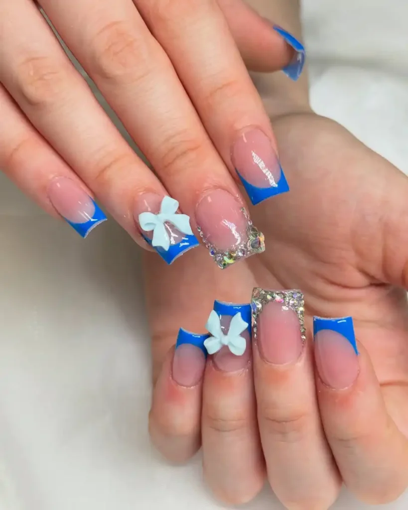
Those bows are big, but the blue tips stop them from looking childish. The rhinestones only frame one nail, which is probably why the whole set still feels balanced. If you’re trying this, don’t ask for extra gems. It’s finished already.
27/35 — White French With Red Crystals
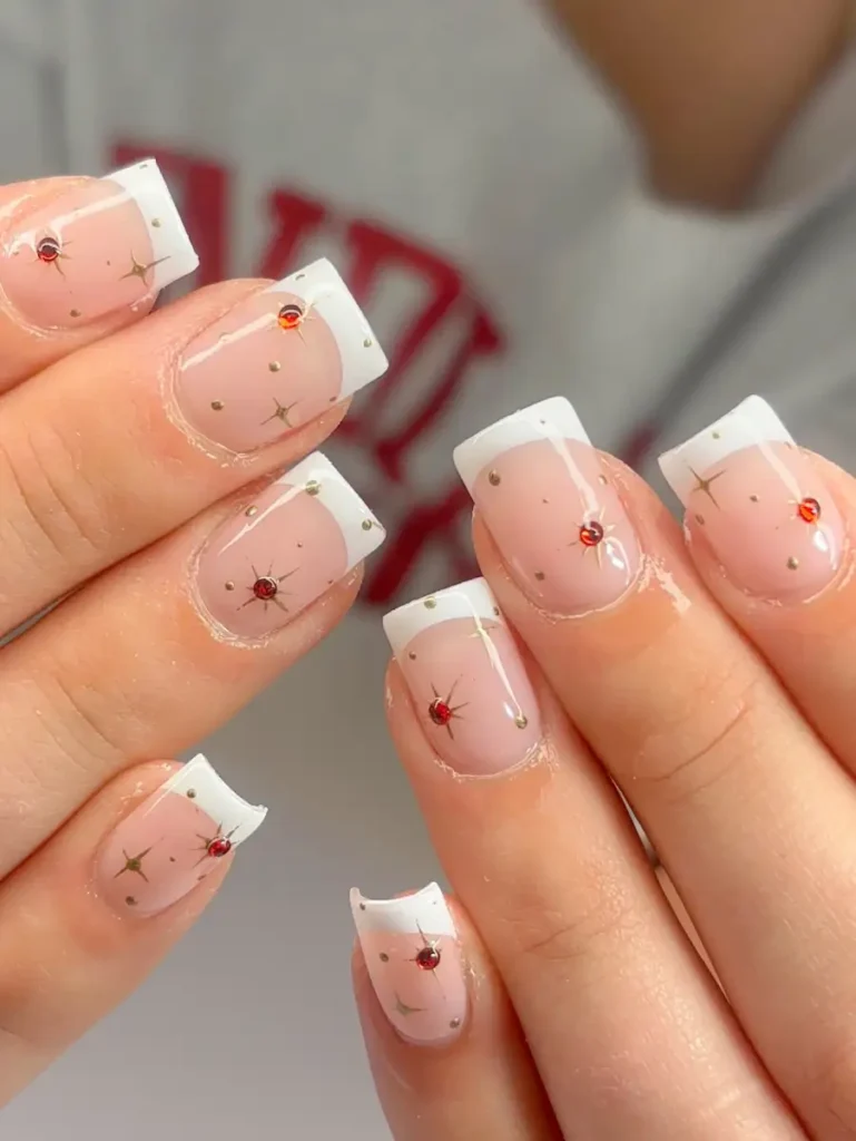
This is basically a classic French with better accessories. The tiny red stones catch your eye before you even notice the little gold stars. I’d copy this if you like simple nails but always feel like they’re missing something.
28/35 — Baby Blue
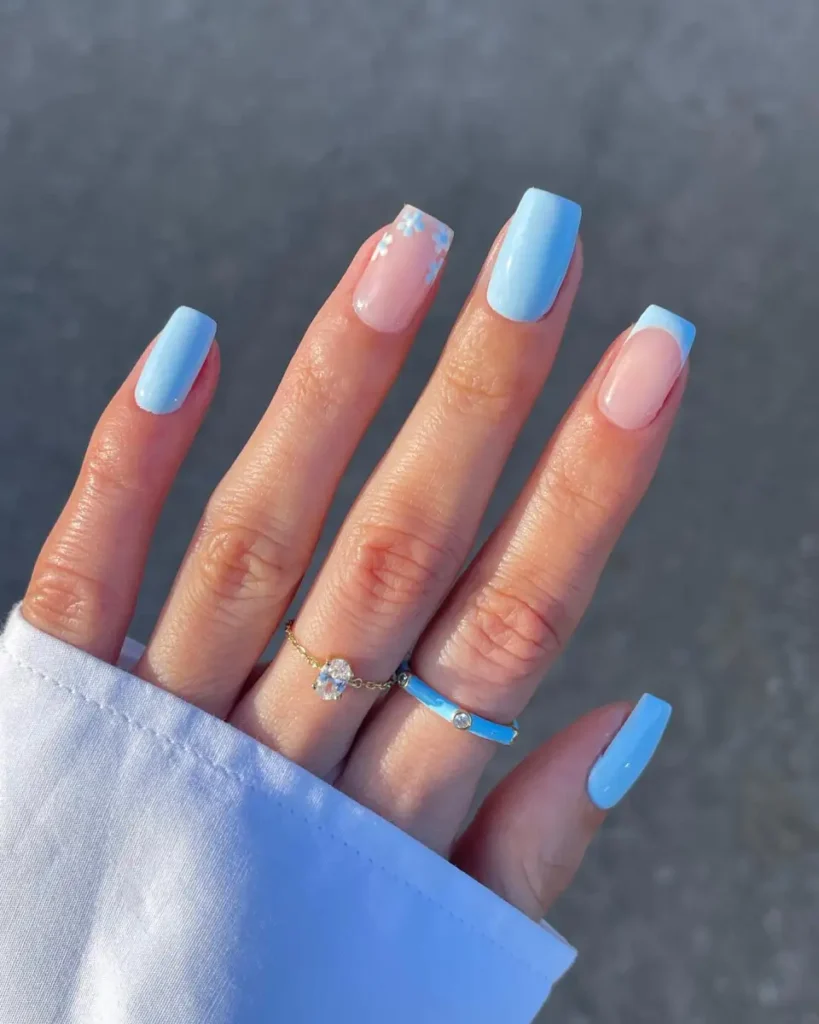
Baby blue usually looks best when you don’t overthink it. The tiny flowers are enough to soften the solid color without stealing attention. I’d skip extra glitter or gems here because the clean finish is exactly what makes this one work.
29/35 — Soft Blue French Tips
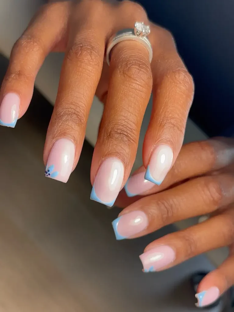
The first thing I’d copy is the thickness of the tips. They’re a little chunkier than a classic French, which makes the blue stand out without looking loud.
The tiny flower in the corner is a nice touch too. It fills the empty space instead of covering the whole nail.
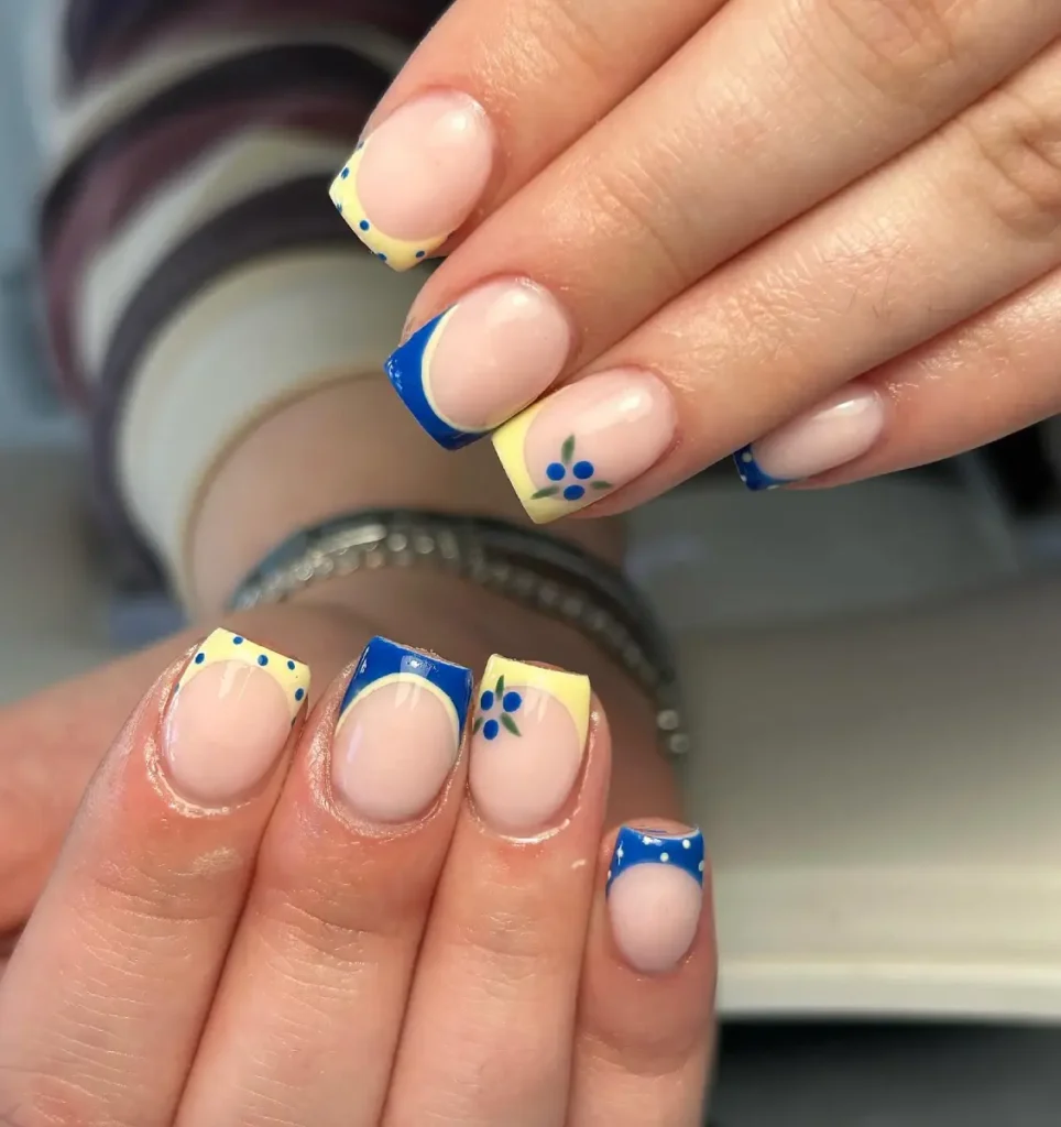
30/35 — Blue and Butter Yellow Combo
Blue and yellow shouldn’t work this well, but the muted shades save it.
The little berries and dotted tips make it feel almost vintage. If you’re bored of plain French tips, this is an easy way to switch things up without choosing a bright color.
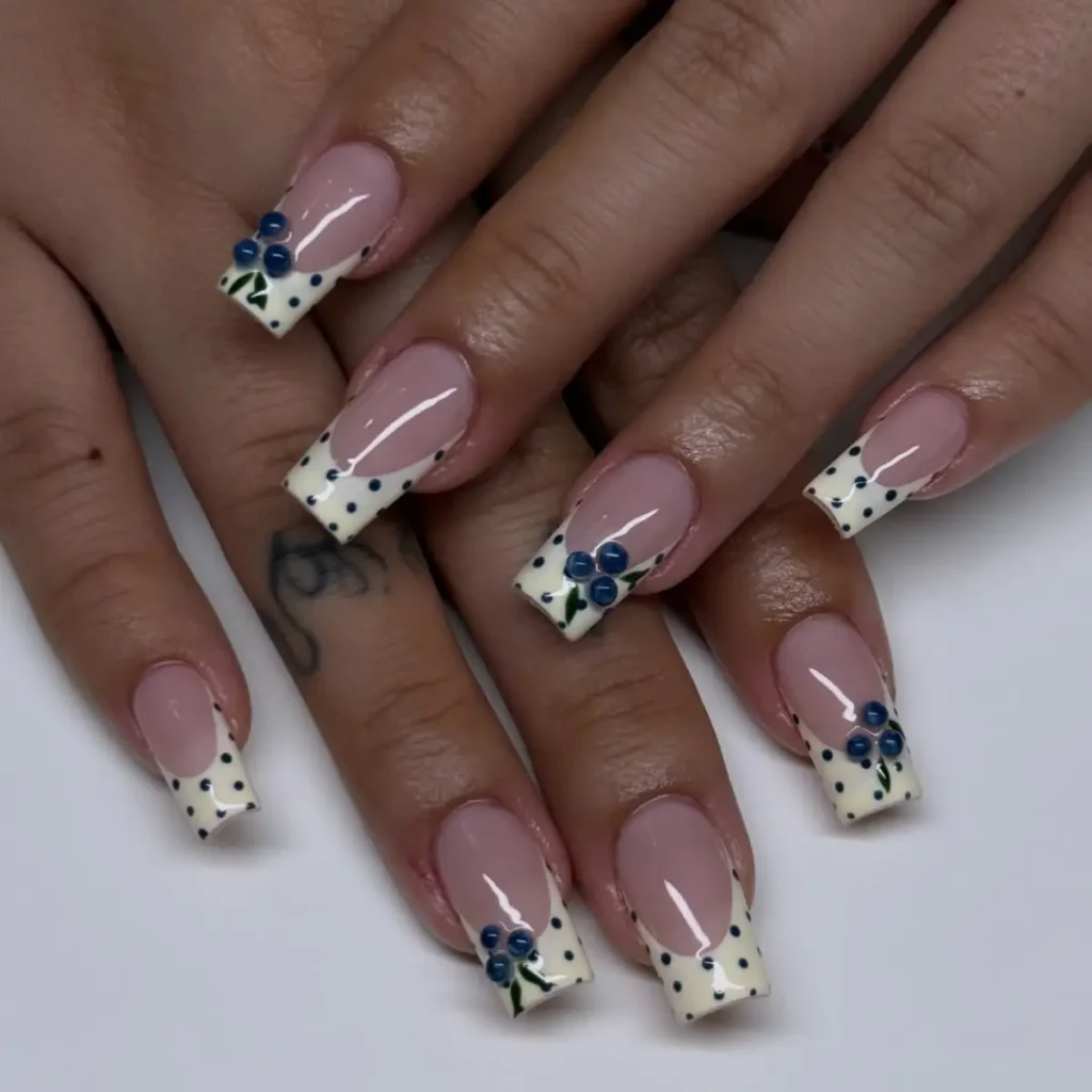
31/35 — Blueberry French Tips
I like that the blueberries aren’t perfectly centered. They almost look hand painted, which gives the whole set more personality.
The dotted French tips are worth copying too. They’re much more interesting than a plain white edge but barely take any extra effort.
32/35 — Classic French
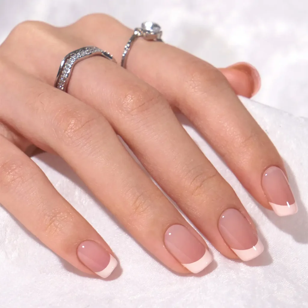
Nothing to reinvent here, and that’s why it works. The smile lines are even, the pink base isn’t too sheer, and the tips are thick enough to still look crisp after a week or two.
If you’re unsure what to get, this is the safe bet.
33/35 — Mint Waves
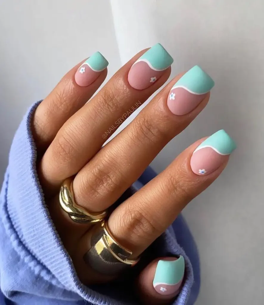
The wavy line changes the whole mood. A straight French would feel predictable, but this has a softer shape that matches the tiny flowers.
I’d keep every nail the same instead of adding accent designs because the curve is already doing the work.
34/35 — Butter Yellow French
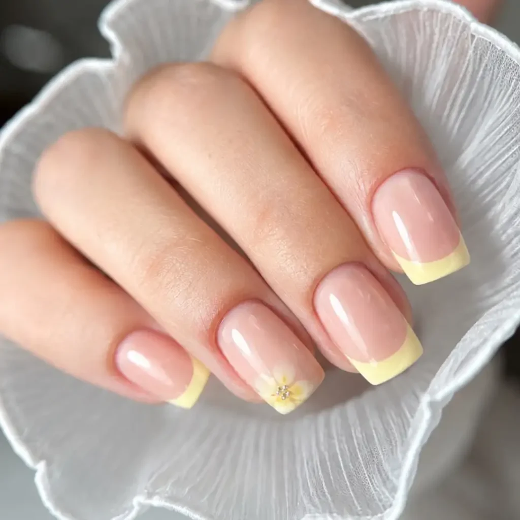
Yellow French tips can look harsh, but this shade stays soft against the nude base. The flower only needs one nail to make sense. Adding it everywhere would’ve made the set feel busy.
35/35 — Mint Minimalist
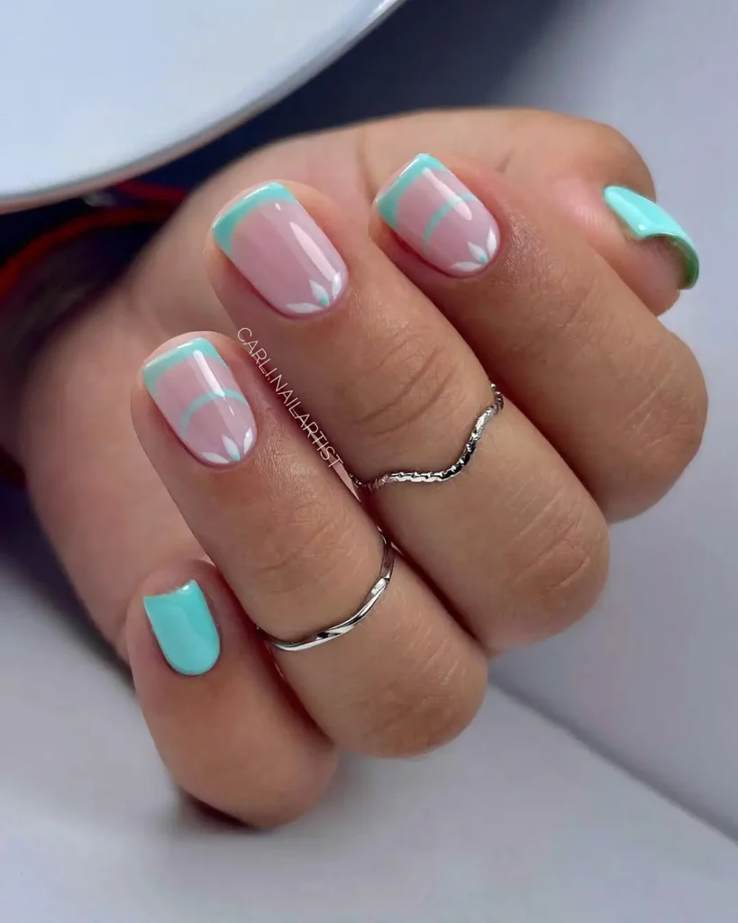
The double lines are a nice trick if you want something cleaner than nail art but less plain than a regular French. I also like that the thumb is solid mint. It breaks the pattern just enough to keep the set from feeling repetitive.
Final Thoughts
Half the fun is mixing ideas instead of copying one set exactly. A color from one manicure, the French tip from another, maybe the flowers from a third. That’s usually how the best nail appointments happen anyway.
Save the ones that made you stop scrolling. Your future self will thank you when you’re sitting in the salon with no idea what to pick.